What started as a side project quickly became a foundational layer powering Translated’s product ecosystem. From internal tools to enterprise platforms, the design system brought clarity, speed, and cohesion to every interface as It aligned design and engineering around shared principles and scalable components.
Role
UI / UX designer @ Translated
Year
2024-2025
Category
Design Systems, UI/UX

Problem
The Lack of a Shared Language
As a UX designer at Translated, I was often tasked with designing features and improvements for our interfaces. But with products ranging from internal tools to enterprise dashboards and SaaS platforms, each with its own branding and requirements, I found myself recreating UI kits for every project. This led to duplicated efforts, inconsistent experiences, and increasing design debt.
The turning point came when I realized these issues weren’t just visual—they were systemic. We lacked a shared foundation to unify how we built and maintained interfaces across teams. A design system could solve this: bringing alignment, reusability, and scalability to our growing product ecosystem.
At first, this initiative started as a side project. I saw the opportunity, and began laying the foundation for what would become a shared resource across multiple teams. Over time, the design system gained traction and evolved into a key asset for Translated’s product strategy.
Impact
The Impact of the DS in Translated
As of writing this case study, the Translated Design System has become a foundational tool—bringing clarity, speed, and alignment across the product lifecycle.
🧩 Design Consistency
Standardized components, colors, and patterns eliminated the visual and UX inconsistencies that once existed across products.
⚡ Faster Design & Development Cycles
Reusable components and documented decisions reduced duplication and improved handoffs, allowing teams to focus on solving real user problems.
📚 Scalable Documentation & Onboarding
A centralized reference made onboarding smoother and enabled better alignment between designers, developers, and product managers.
🤝 Stronger Design–Engineering Collaboration
Shared naming, regular reviews, and feedback loops created a more integrated, cross-functional way of working.
♿ Built-In Accessibility
Semantic structure and contrast-compliant tokens were built in from day one—reducing the need for retroactive fixes and ensuring inclusive design at scale.

First version of the redesign of TranslationOS, with a basic light / dark mode switch
Research
Reading Between the Interfaces
Early on, I realized building a design system wasn’t just about reusable components—it was about solving deeper alignment issues across teams and products.
So I began with a few key questions: Why were similar screens built differently? Why did patterns vary so much? Where did users feel the most friction?
To find answers, I ran a thorough UI audit—gathering screens from across our tools and focusing on repeated patterns. The audit quickly revealed various problems:
Our existing UI kits were based on our branding system, which worked well for marketing but fell short for product design.
The color palette lacked sufficient contrast and variety, making it difficult to meet accessibility standards or design flexible UI states.
Typography styles were unstructured, leading to visual hierarchy issues and inconsistency in content presentation.
Many components with similar functions behaved differently across tools, creating friction for users and inefficiencies for developers.
These findings reframed the challenge from fixing isolated flaws to building a unified, scalable foundation for product design at Translated. At that time TranslationOS, our enterprise platform in early development, became a live testing ground where these insights could be immediately applied and validated.

Diversity of Translated products before the Design System
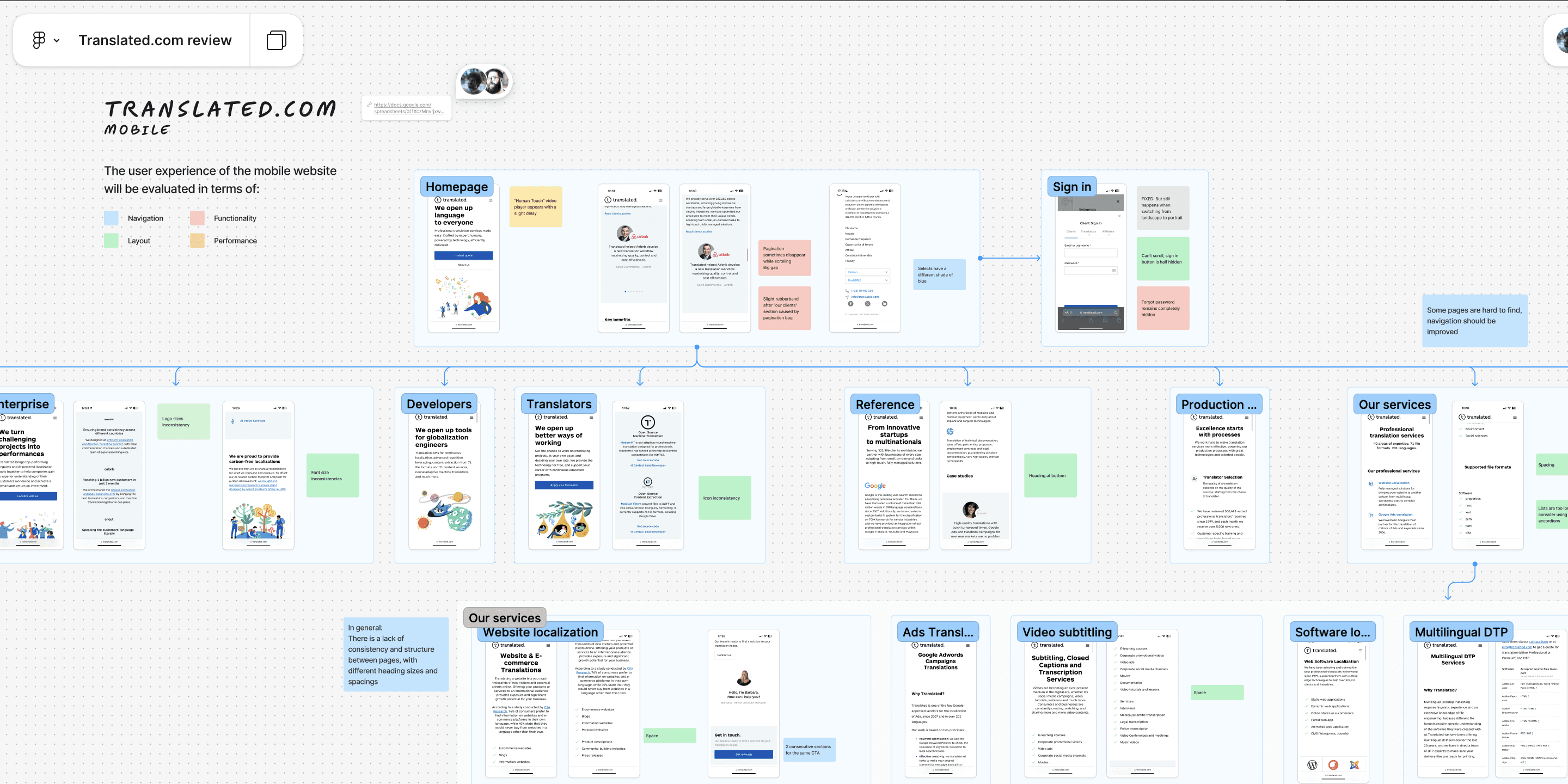
UI Audit - Translated.com website
System Architecture
Designing a System That Can Speak Every Product’s Language
One of the earliest and most important challenges in building the design system was defining its foundation—not just in terms of components, but in how it would scale, adapt, and remain flexible across a growing suite of products.
To guide this, I structured the system around three core layers:
I started by defining a strong foundation of design tokens — color, spacing, typography, elevation, and radius—rooted in accessibility and theming. The brand palette was reworked into semantic tokens, while typography and spacing were restructured to bring clarity and consistency to our layouts.
At the component level, I followed Atomic Design principles with a practical lens. Core elements like buttons and inputs were built with variants, states, and modifiers to support real-world use cases without overcomplicating the system.
Finally, I introduced reusable patterns and templates — from form structures to navigation layouts—to help designers move beyond isolated components and think in flows. This layered approach made the system both robust and adaptable.
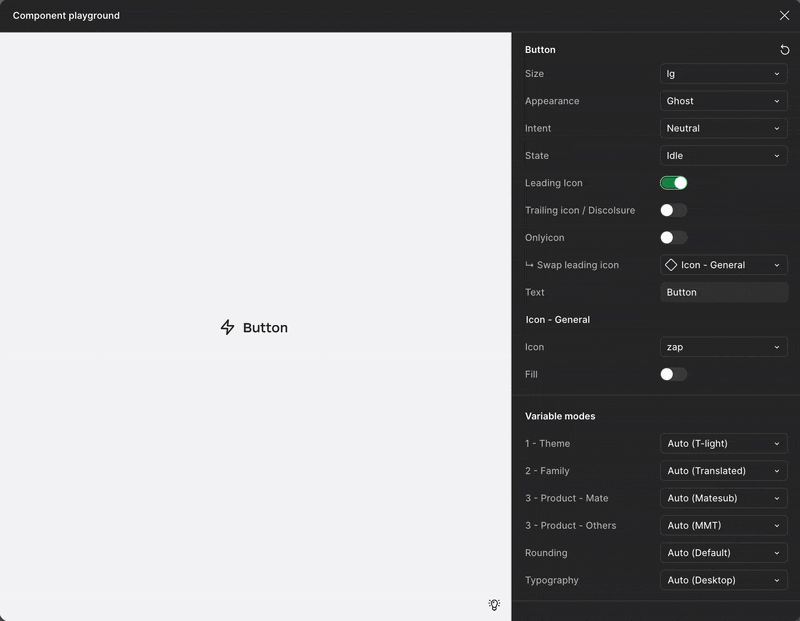
Everything was structured and documented in Figma, using clear naming conventions, nested variants, and auto-layout rules. I also began defining a shared naming language that could translate to code, reducing friction and ambiguity for engineers. But it’s important to point out that these tokens had the necessity to be flexible and easy to understand.
This layered, scalable architecture allowed the design system to evolve from a support tool for a single project into a foundational platform for all product teams—stable enough to serve current needs, and flexible enough to grow with the company.


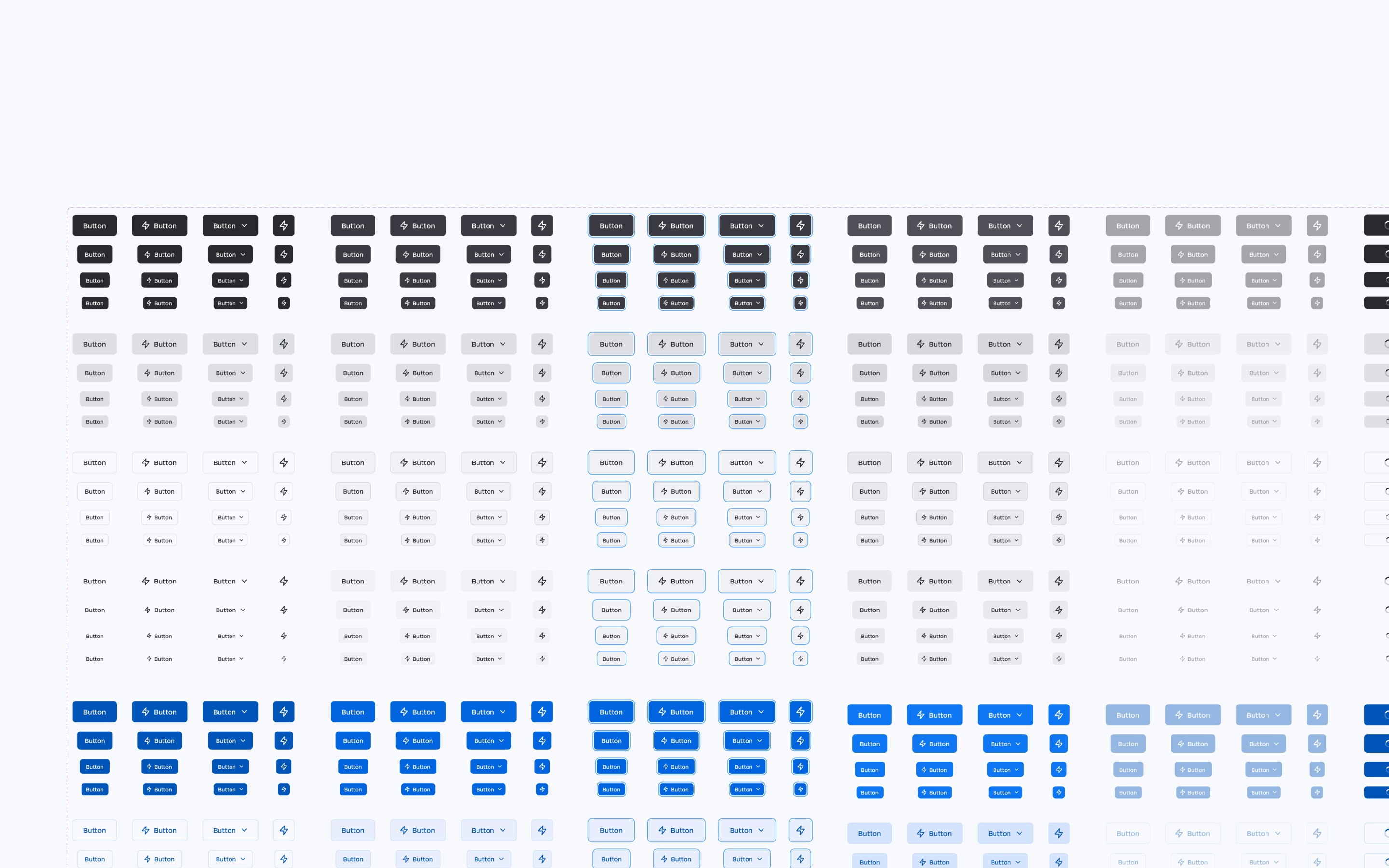
Key component
Behold the Mighty Button
Among all components, the button became a defining piece of the system—technically and symbolically. It was one of the first elements I designed, and it quickly became a test for how scalable, accessible, and flexible our system needed to be.
While simple at first glance, it had to perform across many scenarios: multiple types and sizes (primary, secondary, ghost, critical), all interactive states (hover, focus, disabled, loading), icon-only and hybrid layouts, and consistent behavior across platforms and themes—including dark mode.
I built it on semantic tokens (e.g., fill-accent-primary-idle) to support future theming, and structured it in Figma with clean booleans and auto-layout rules that translated easily to code. My graphic design background pushed me to refine the optical balance—adjusting padding, alignment, and icon positioning for a polished, visually correct feel.
Designing the button wasn’t just about function—it set the tone for the system: precise, adaptable, and built with real use in mind. Over time, it became a shared language—anchoring consistency across dashboards, tools, and mobile views alike.
Results
One Language Across Products
As the system matured, the real challenge became implementation—bringing it into live products and embedding it into daily workflows.
Lara and TranslatedOS became the primary testing grounds. Despite having different user needs and constraints, both shared common issues: fragmented UI, inconsistent patterns, and growing technical debt. We saw these challenges not as blockers, but as opportunities to build and refine the system in real time. Features were shipped faster than before, and the system grew alongside the products—rooted in real use cases rather than hypothetical scenarios.
Working closely with designers, PMs, and developers, we created a shared workflow to support adoption at scale:
Consistent naming conventions between Figma and code to ease handoff
Cross-functional reviews to validate components visually and technically
A feedback loop where bugs and edge cases actively shaped system updates
This collaboration turned the system from a side project into a shared foundation. Developers began contributing improvements, PMs included it in planning, and designers could work faster with confidence. It’s still evolving—but today, it’s an integral part of how we build at Translated.
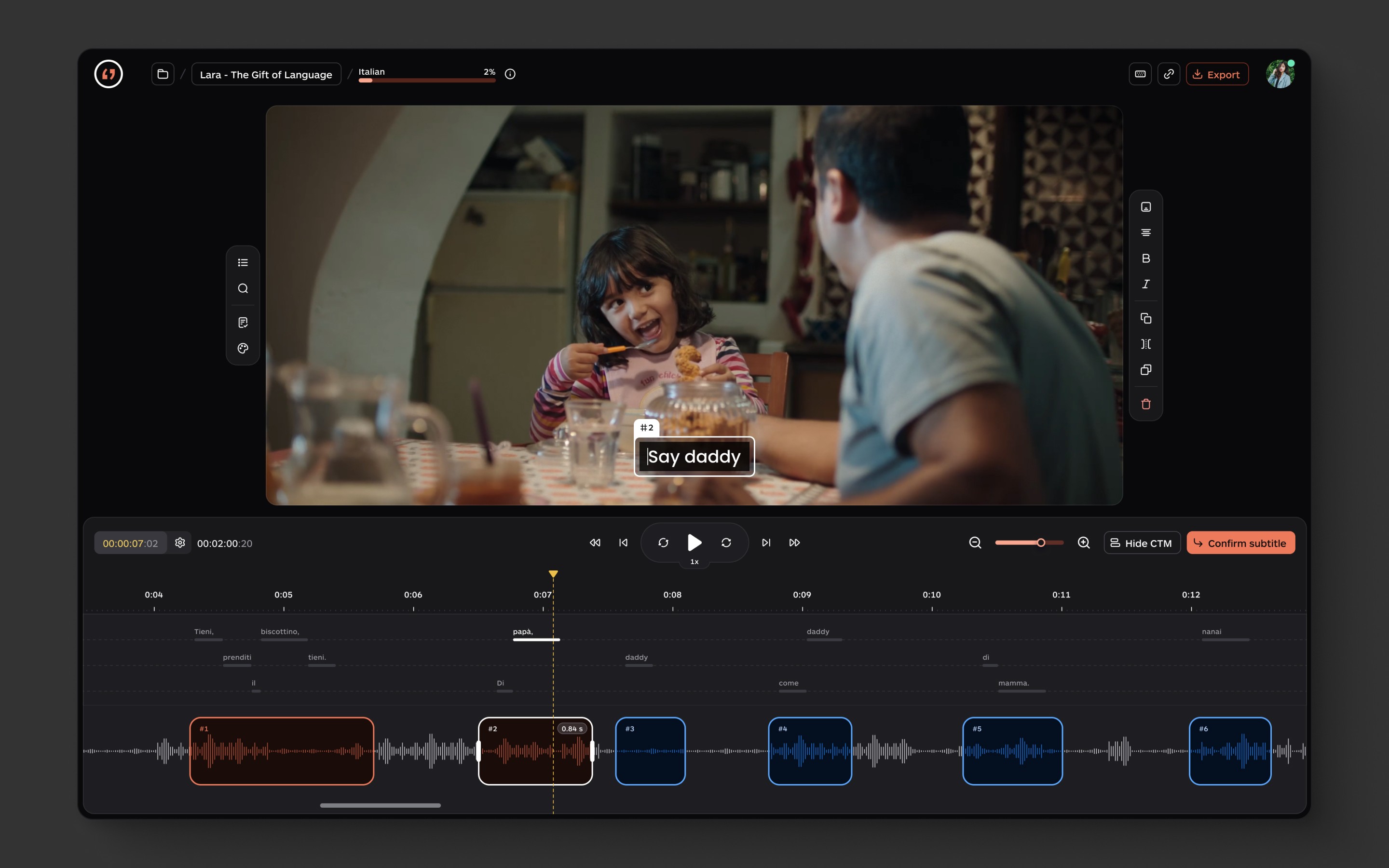
Lara - created from scratch with the help of the Design System - Light / Dark mode

TranslationOS - Updated with DS 2.0, which supports multiple themes
Matesub - Updated with DS 2.0, which supports multiple themes
The Future of Translated DS
Scaling the System, Expanding the Conversation
As of writing this, the Translated Design System has reached a stable and scalable foundation. It now includes:
A multi-product token system built for flexible theming
Clear documentation and Accessibility guidelines that streamlines adoption across teams.
100+ reusable components with 2,500+ variants supporting diverse states, screen sizes, and use cases.
But its strength lies not just in what it solves today—it’s how it’s built to scale and evolve. As new products emerge, the system will act as a shared foundation: consistent at its core, but adaptable to different platforms, audiences, and visual identities.
One key area of growth is theme flexibility. With semantic tokens in place, we’re expanding support for multiple visual themes—empowering teams to tailor experiences while maintaining consistency under the hood.
Technically, the system will keep evolving with our tools—especially Figma. As we explore advanced component libraries, automation, and even AI-assisted workflows, the DS will adapt while staying rooted in usability, clarity, and accessibility.
Most importantly, it’s no longer a static library—it’s a living product. One shaped by real-world use, collaboration, and iteration. It’s built to last—but more importantly, it’s built to grow.

Collaborators:
Romolo Buondestino
Director of UX
Giulia Pelos
UX Designer
Luca Barone
Front End Engineer
Marco Ilari
Front End Engineer
Matteo Montolli
UX Designer @ MOZE